哎哎
1、鼠标移进网页里,不见了= =
*{ cursor: none!important; }
2、简单的文字模糊效果
*{ color: transparent; text-shadow: #111 0 0 5px; }

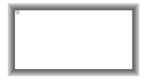
3、多重边框
.div { box-shadow: 0 0 0 6px rgba(0, 0, 0, 0.2), 0 0 0 12px rgba(0, 0, 0, 0.2), 0 0 0 18px rgba(0, 0, 0, 0.2), 0 0 0 24px rgba(0, 0, 0, 0.2); height: 200px; margin: 50px auto; width: 400px }
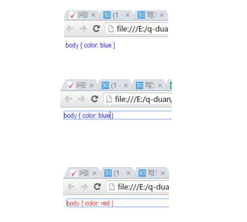
4、实时编辑CSS
<!DOCTYPE html> <html> <body> <style style="display:block" contentEditable> body { color: blue } </style> </body> </html>
5、CSS中简单运算
.div{ width: calc(100% - 500px); }
6、border-radius
因为基本上很多人都是这么用的:
.div { border-radius: 4px; }
稍微高端一点的是这样的:
.div { border-radius: 4px 6px 6px 4px; }
然而,终极黑科技是这样用的:
.div { border-radius: 5px 5px 3px 2px / 5px 5px 1px 3px; }
border-radius 它可以赋8个值:
斜线前面的影响的是水平方向,斜线后面影响的是垂直方向,
各个数字就分别代表四个不一样的方向。
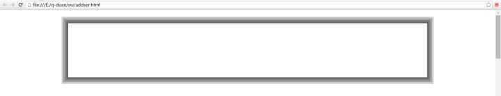
7、outline-offset
在input下写CSS的时候对下面的语句会很熟悉:
input { outline : none; } input:focus { outline : none; }
这就是将input输入框去掉默认的蓝线框的方法。
CSS中还有一个outline-offset属性,在这个属性中,你可以设置默认线框的距离:
input { outline-offset: 4px ; } (web前端学习交流群:328058344 禁止闲聊,非喜勿进!)
调节该属性值的大小你就可以看到outline的距离变化了。
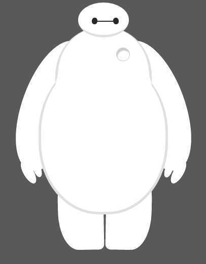
最后献上一同事实习前的大白demo
<!doctype html> <html> <head> <meta charset="utf-8"> <title>Baymax</title> <link rel=stylesheet href="demo2.css"/> </head> <style> body { background: #595959; } #baymax{ /*设置为 居中*/ margin: 0 auto; /*高度*/ height: 600px; /*隐藏溢出*/ overflow: hidden; } #head{ height: 64px; width: 100px; /*以百分比定义圆角的形状*/ border-radius: 50%; /*背景*/ background: #fff; margin: 0 auto; margin-bottom: -20px; /*设置下边框的样式*/ border-bottom: 5px solid #e0e0e0; /*属性设置元素的堆叠顺序; 拥有更高堆叠顺序的元素总是会处于堆叠顺序较低的元素的前面*/ z-index: 100; /*生成相对定位的元素*/ position: relative; } #eye, #eye2{ width: 11px; height: 13px; background: #282828; border-radius: 50%; position: relative; top: 30px; left: 27px; /*旋转该元素*/ transform: rotate(8deg); } #eye2{ /*使其旋转对称*/ transform: rotate(-8deg); left: 69px; top: 17px; } #mouth{ width: 38px; height: 1.5px; background: #282828; position: relative; left: 34px; top: 10px; } /*躯干和腹部*/ #torso, #belly{ margin: 0 auto; height: 200px; width: 180px; background: #fff; border-radius: 47%; /*设置边框*/ border: 5px solid #e0e0e0; border-top: none; z-index: 1; } #belly{ height: 300px; width: 245px; margin-top: -140px; z-index: 5; } #cover{ width: 190px; background: #fff; height: 150px; margin: 0 auto; position: relative; top: -20px; border-radius: 50%; } /*心脏*/ #heart{ width:25px; height:25px; border-radius:50%; position:relative; /*向边框四周添加阴影效果*/ box-shadow:2px 5px 2px #ccc inset; right:-115px; top:40px; z-index:111; border:1px solid #ccc; } /*手臂*/ #left-arm, #right-arm{ height: 270px; width: 120px; border-radius: 50%; background: #fff; margin: 0 auto; position: relative; top: -350px; left: -100px; transform: rotate(20deg); z-index: -1; } #right-arm{ transform: rotate(-20deg); left: 100px; top: -620px; } /*手指头*/ #l-bigfinger, #r-bigfinger{ height: 50px; width: 20px; border-radius: 50%; background: #fff; position: relative; top: 250px; left: 50px; transform: rotate(-50deg); } #r-bigfinger{ left: 50px; transform: rotate(50deg); } #l-smallfinger, #r-smallfinger{ height: 35px; width: 15px; border-radius: 50%; background: #fff; position: relative; top: 195px; left: 66px; transform: rotate(-40deg); } #r-smallfinger{ background: #fff; transform: rotate(40deg); top: 195px; left: 37px; } /*大腿*/ #left-leg, #right-leg{ height: 170px; width: 90px; border-radius: 40% 30% 10px 45%; background: #fff; position: relative; top: -640px; left: -45px; transform: rotate(-1deg); z-index: -2; margin: 0 auto; } #right-leg{ background: #fff; border-radius:30% 40% 45% 10px; margin: 0 auto; top: -810px; left: 50px; transform: rotate(1deg); } </style> <body> <div id="baymax"> <!-- 定义头部,包括两个眼睛、嘴 --> <div id="head"> <div id="eye"></div> <div id="eye2"></div> <div id="mouth"></div> </div> <!-- 定义躯干,包括心脏 --> <div id="torso"> <div id="heart"></div> </div> <!-- 定义肚子腹部,包括 cover(和躯干的连接处) --> <div id="belly"> <div id="cover"></div> </div> <!-- 定义左臂,包括一大一小两个手指 --> <div id="left-arm"> <div id="l-bigfinger"></div> <div id="l-smallfinger"></div> </div> <!-- 定义右臂,同样包括一大一小两个手指 --> <div id="right-arm"> <div id="r-bigfinger"></div> <div id="r-smallfinger"></div> </div> <!-- 定义左腿 --> <div id="left-leg"></div> <!-- 定义右腿 --> <div id="right-leg"></div> </div> </body> <html>